Stories worth telling
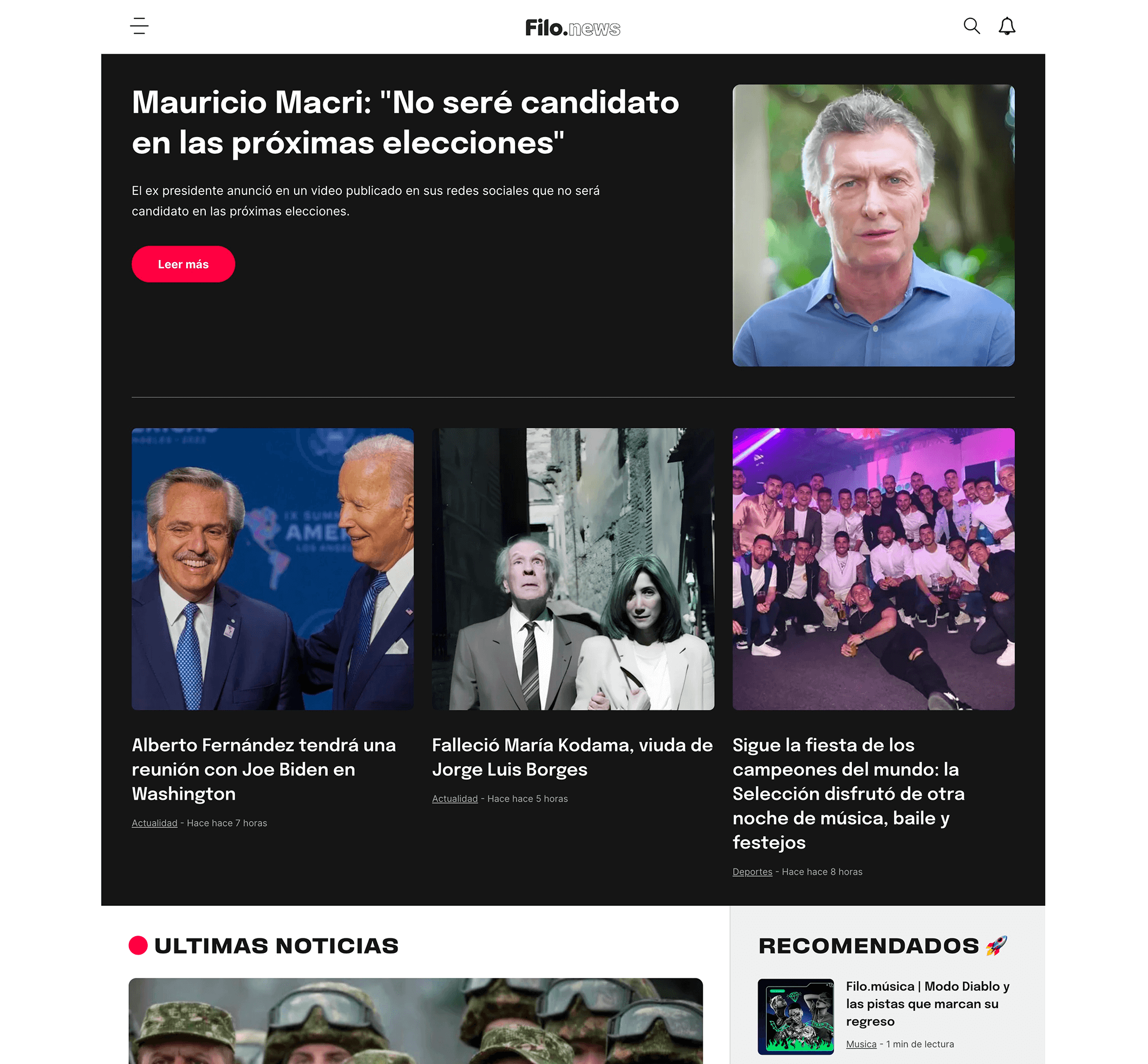
Filo News is a modern news portal that has gained popularity in recent years due to its unique approach of relying on social media to tell stories and communicate the truth to people. As the portal grew in popularity, the team recognized the need to redesign the website to provide a better user experience and improve engagement with readers.
Type
Product Design
Contribution
Product Designer
Design Strategist
Platform
Desktop / Mobile Web
Team
Jerónimo Costa – CTO
Magali Sabella – Project Manager
Matías Mediña – Head of Strategy
Sebastián Dana – UI Designer

(01)
Challenge
We identified two important challenges to address in the website redesign. First, we recognized the need to broaden our audience beyond social media and increase visitor traffic outside these platforms. Second, the team aimed to convey a sense of credibility and professionalism to appeal to readers aged 35 and above while maintaining its reputation as an innovative and disruptive news portal for younger readers.

(02)
Immersion
We started deep within Filo News’s value proposition to gain clarity and alignment.
During the immersion phase, I facilitated two half-day strategic workshops, where we tackled the most pressing questions of the company with key stakeholders and team members. Using the insights gathered from these sessions, I helped the team align around a shared objective and establish a north star for the project.
What I did:
1:1 Interviews with Stakeholders
Strategic Workshops
Competitive Audit
Brand Audit
(03)
Product Strategy
During the product strategy phase, we established important goals for the website redesign, such as quick loading speed, support for Facebook Instant Articles, and pre-loading of news articles above the fold. I also conducted benchmarking research to learn from our main competitors and identified key attributes of our target audience that were delivered using proto-personas. This phase was critical to ensure that the redesign meets the needs of both the business and the target audience.

(04)
User Experience
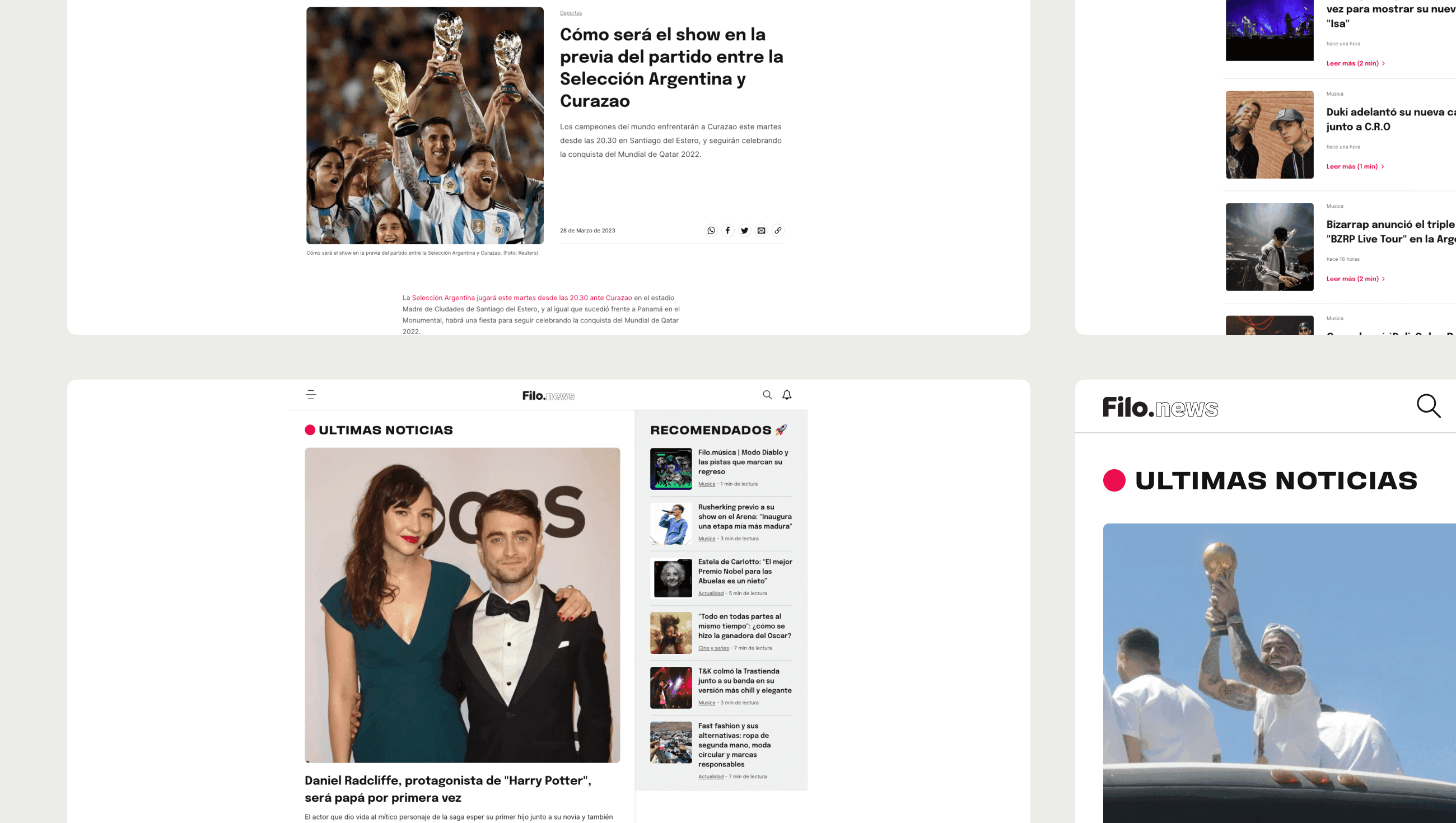
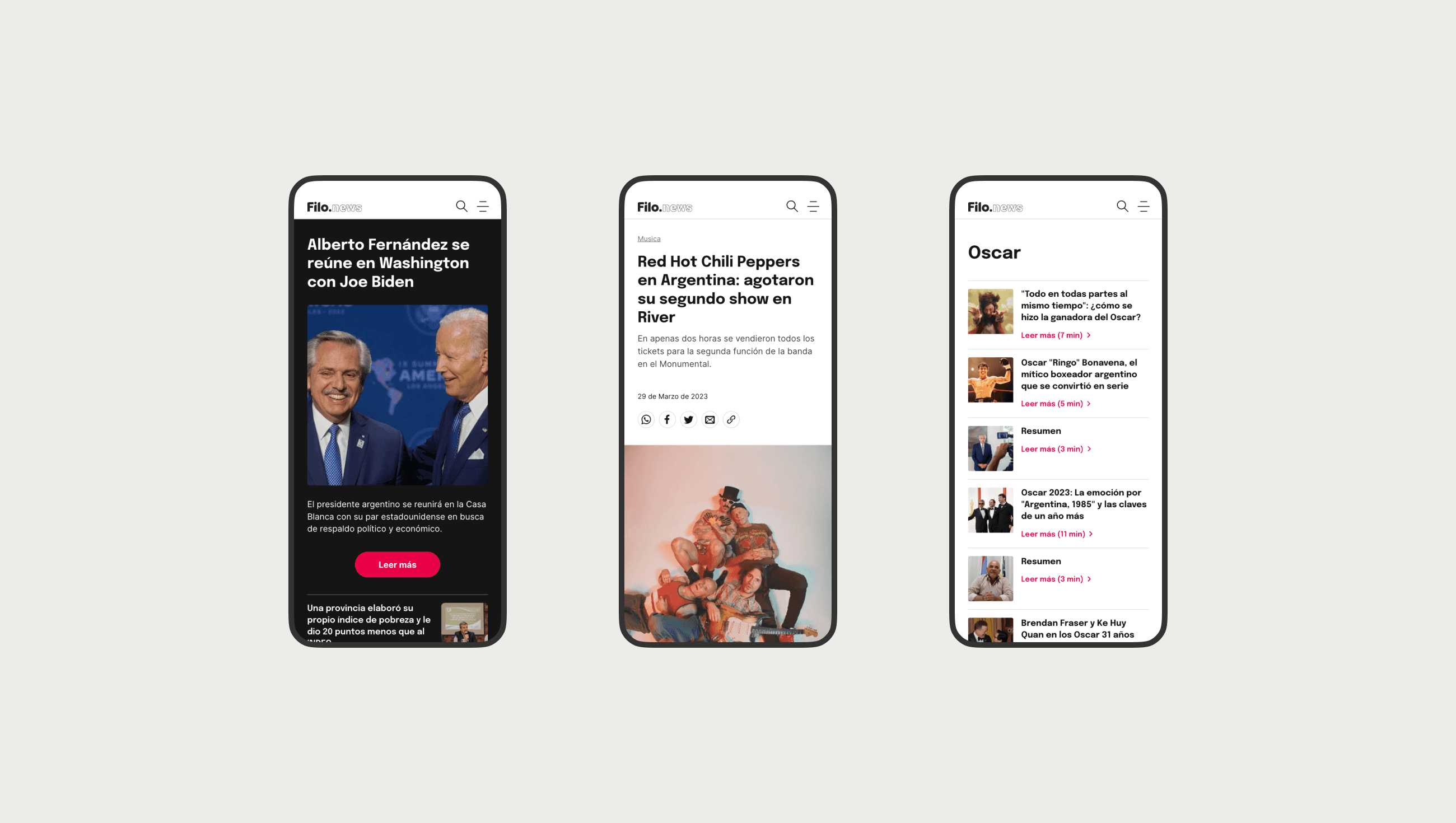
Based on insights gathered during the immersion and product strategy phases, I designed an engaging and user-friendly website. To convey a sense of professionalism and provide a good readability, we incorporated design elements such as clean lines, significant white space, and a carefully crafted color palette. Additionally, we optimized the website for SEO and use on various devices, including laptops, tablets, and smartphones, to provide a great experience to every user, no matter their preferences.
What I did:
User Flows
Information Architecture
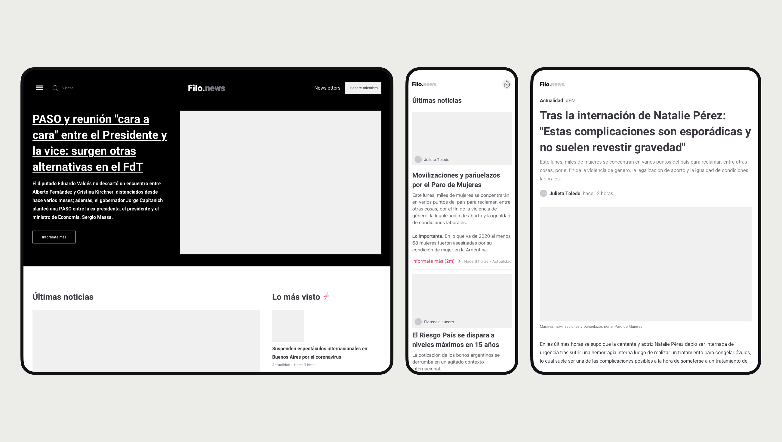
Wireframes
1:1 Usability Testing with team members and users
Hands-off Documentation


